Samsung Galaxy Book buying guides
Role
Team
Company
The problem
Despite a strong product line-up, Samsung struggles with low brand awareness in the laptop category. Most consumers looking to purchase a new laptop won’t initially consider them, largely because the brand is predominantly associated with smartphones and TVs rather than computing.
A Help Me Buy series of pages existed on their website to bridge that gap and guide buyers toward a purchase decision, but users weren’t engaging or converting as expected.
My role
I was brought in alongside to investigate the reason for poor performance, and redesign the experience.
Outcome
- Redesigned the main hub page to help usersresearching laptops learn all about the Samsung models.
- The page has seen significant improvement in terms of engagement as demonstrated by improved scroll rate and time spent on page.
Before
After
Approach
While the brief was fairly clear, it was important to ensure that the investigation was broad enough to understand the full picture before jumping on redesigning the buying guide experience. I needed to first have a deeper understanding of the what was happening on these pages and on the overall buying journey.
The discovery work was divided between myself and the researcher; while I focused on the existing on-page experience through heuristic evaluation and analytic data, the researcher focused on competitor analysis and brand awareness.
What hid below the fold
The heuristic evaluation identified the main hub page as the primary point of friction and the issues were predominantly content-related, structural and navigational.
The analytics data confirmed a number of assumptions made through the heuristic review, and it also revealed something very interesting, which will lead the direction for the final solution.
What wasn't working
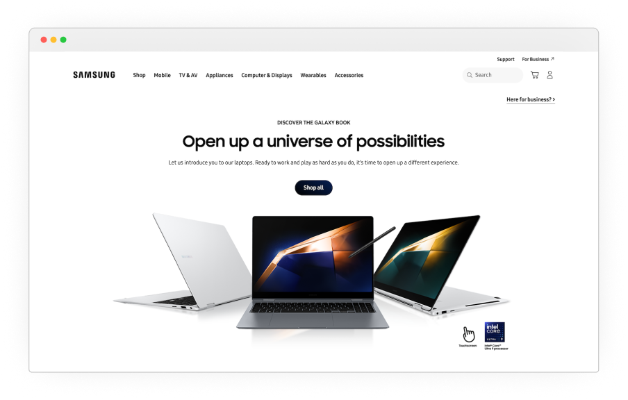
Hero section
The hero section took up the whole viewport, pushing more below the fold. Users were not encourage to scroll down and, with the CTA “shop all”, they were directed to navigate away from this page.
This section is the first thing that user see and it wasn’t unexpected that the scroll rate dropped off significantly below the fold.
No 'buying guide' content
The page was positioned as buying guides, yet the content was telling a different story. The content was predominantly purchase-led, prioritising links to products rather than introducing users to the laptops. Users likely expected to find a buying guide, not just links to product and marketing content.
The data revealed low engagement overall, short time spent on page, low click through rate to other pages and high exit rate which was telling, users ere not finding the content and leaving.
Difficult navigation
Navigating to more existing buying guide content was difficult. Other guides were signposted way down a very long page which suffers from low exposure rate and once again, this page was missing the point of being a fit for purpose hub that could help users discover a relatively unknown series of products.
It wasn't all bad
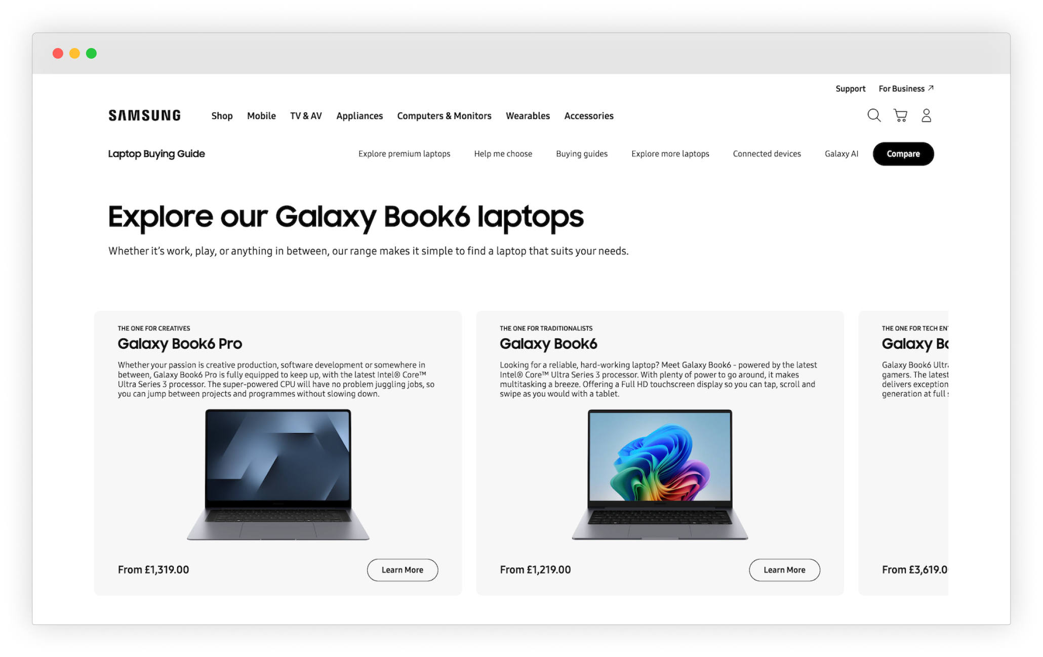
Comparison table engagement
As teased earlier, not all data was bad news.
Almost at the bottom of the page users could find a table comparing the latest Galaxy Book laptops, which looked like it was the most useful content on the whole page. Maybe not so surprisingly, the data suggested that, of the users that scrolled that far, a large percentage did engage with the table. The number was low, but engagement was significant.
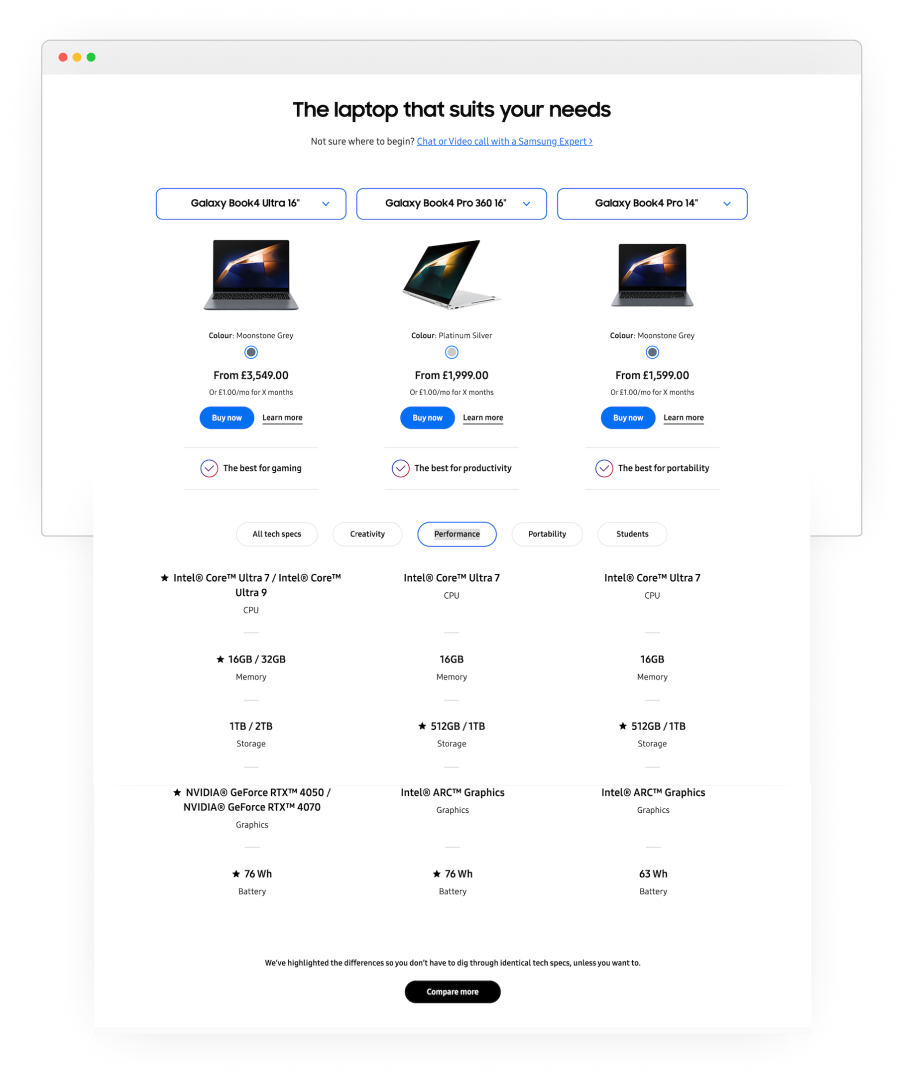
What stood out on the table was the labelling of each laptop as ‘Best for …’, paired with a feature to filter specs by use case, this was most likely the reason for high engagement. The comparison table was delivering information that users found valuable.
Key issues recap
The buying guide hub lacked meaningful content, the page layout didn’t invite exploring the page or hub. In conclusion these are likely the reasons why it failed to give users reasons to engage and convert.
The solution
With a clear picture of where the experience was breaking down, I moved on finding a solution that needed to address key issues.
The new experience should:
- Introduce users to Samsung laptops with content aimed at their needs and lifestyle.
- Make sure users have enough information to move over to the buying funnel
- Direct users to more relevant buying guides with ease.
We will know if we achieved it by seeing improvement in these metrics: reduced scroll rate, increased engagement and click-through to products/relevant guides. Which in turn cant translate into conversion.
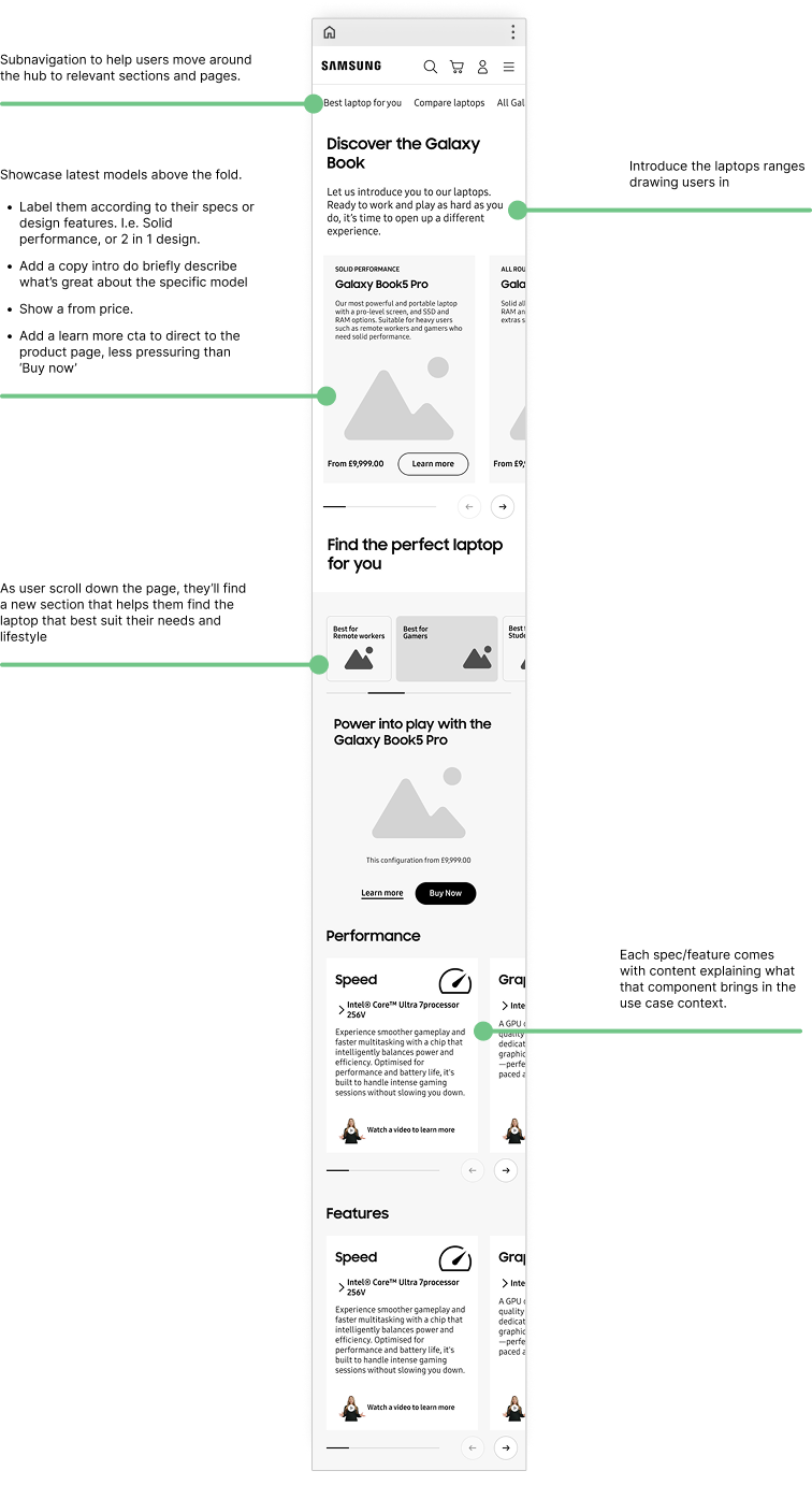
A clear narrative for the hub page
Rather than just wanting the user to buy a laptop, the content on the page should communicate why they are great products and why they need one.
I wanted to capture users from the start by introducing the latest laptops right above the fold, then moving onto more detailed descriptions.
Two distinct sections
The guide page needed to speak to less tech savvy users without being so basic that it loses the interest of the more experienced ones. To achieve this I structured the page around two distinct sections.
The first geared towards feature-focused users, those looking for reliable performance, or a specific design feature (aka the ‘experts’).
The second took a lifestyle approach was directly inspired by the high engagement seen on the existing comparison table. I organised this section by ‘Best for’ and allowed users to find their ideal laptop by use case: ‘Best for remote work’, ‘Best for students’, and so on.
Useful content
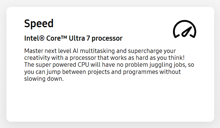
To cater to less technical users, I thought of including hardware and features explainers for key components.
The twist was that, rather than generic a description, each explainer would be contextualised to the specific use case, explaining why that specific component was the right choice for that need.
To bring this content to life I collaborated closely with the copywriter. I drafted examples to illustrate the content direction, giving them a clear idea of what the copy should convey.
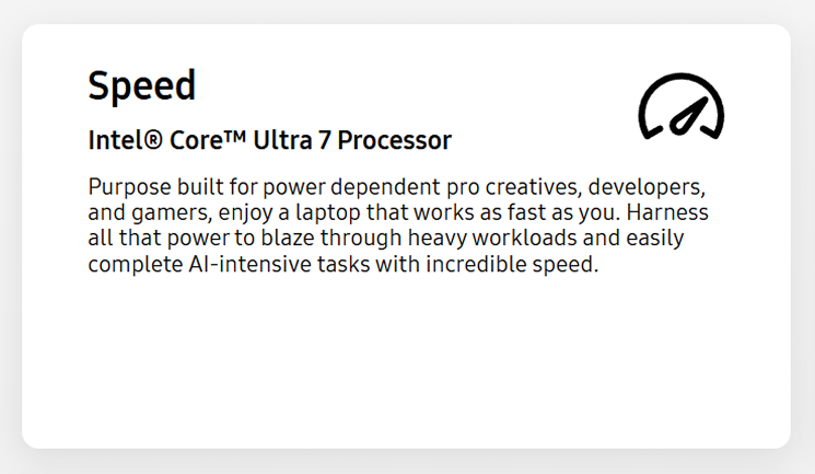
Processor description for 'Best laptop for professionals'
Processor description for 'Best laptop for creativity'
Improving the navigation
Subnav bar, on average, see low interaction on the Samsung website, but I believe they are important. Even if the links receive low or no clicks, users can at a glance see what kind of content they’ll find in a specific area of the site. It acts like the index of a book.
The challenges
Components constraints
The page would need to be built using existing Adobe Experience Manager (AEM) components.
To understand what this meant in practice, I sat with the publisher responsible for implementing static pages to analyse what was feasible.
It became clear that the optimal solution couldn’t be delivered within those constraints, specifically, the ‘Best for’ filtering feature and its content structure, which allowed users to find and learn about their ideal laptop by use case, couldn’t be built using existing components and would require custom dev work.
Not having this feature would have meant using content cards that would have considerably limited the quality of the experience.
Getting client buy-in
Once drafting wireframes of the ideal solution, I presented it directly to the client making sure to highlight why custom dev work would have been essential.
I went through what the data showed, why this feature is central to the solution, highlighting how we wouldn’t improve engagement if we built entirely within AEM.
The business case was clear, and we agreed to implement as much as possible using AEM components and custom dev work where necessary.
Results & impact
The solution was grounded in a clear evidence base, addressing the specific content gaps and navigational failures the heuristic and analytics had identified, and centring the one feature the data had shown users actually engaged with. The case for the approach was strong enough to secure client buy-in for custom development work, which in itself represents a meaningful outcome.
Add Your Heading Text Here
Add Your Heading Text Here
Learnings
Getting stakeholders on board with UX decision, as we know, is not an easy feat. It can be difficult even when presented with evidence, but that doesn’t mean we shouldn’t try. We are on the side of the user as much as we are on the business side. If we make the experience enjoyable and useful for the user, it can translate into a healthier conversion rate. Win-Win.